
Good Night, Gutenberg
In a hot lead operation, any fool could make up a page of straight matter but it takes someone with a certain flair to put together a big display ad. Take one of those supermarket ads. You’ve got maybe six different typefaces in as many sizes. They all have to be leaded right or the page wouldn’t lock. Throw in a bunch of little engravings of pork chops and nylon stockings plus the brand name logos, add a halftone block of a roast turkey and a fancy border around the coupons and you’ve got a hell of a job on your hands. But it’s work that shows what you can do. So imagine Bill Neelans going out to Idaho a few years back to see the wife’s sister. Neelans is a compositor but has done enough make-up in his day to know its demands. Printers are social sorts who like to drop by local shops in strange places just to see what’s going on. This little paper in Idaho had just gone offset and Bill
Lynton Appleberry Linotypist
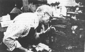
Scholars may differ but I say that Lynton Appleberry is the inventor of the “Linotypist’s Note”. In 1970, 1 was the editor of my college paper and Lynton did most of the typesetting for it down at the Yellow Springs News. I falsely prided myself on my grammatical taste and thought I had organized a foolproof system of proofreading. I had vowed there would be no typos in my paper. Early on, my proofreaders brought me galleys to point out that the typesetter was changing the copy. My editorial blood immediately boiled until I studied the galleys. Lynton was improving the copy fixing spelling, chopping out phrases of garbled horror, getting some agreement in number and tense. I swallowed my pride but urged my copydesk to greater vigilance. Photograph by John Fleischman Then the Linotypist’s Notes started turning up on the galleys. Right in the middle of my lengthy discourses on the college’s enfeebled finances, there appeared parenthetical glosses on the history of the matter under the bold face heading of “Linotypist’s Note.” At first,
A Linotypist’s Notes
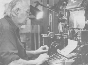
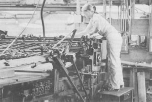
Being an Account of a Brief Apprenticeship in an Obsolete Trade On the cover-A Linotype assembly elevator with the gate closed. This is the center of an operator’s attention as the mats tumble down and are arranged automatically in lines. The spacer bands adjust themselves to fill out the line but only so many letters can fit in any measure, proving the old trade adage that “type is not rubber.” Modern photocompositors have lenses that can distort the image of the letters to fit where they couldn’t .Today, type is rubber. A Linotype assembly elevator with the gate closed. This is the center of an operator’s attention as the mats tumble down and are arranged automatically in lines. The spacer bands adjust themselves to fill out the line but only so many letters can fit in any measure, proving the old trade adage that “type is not rubber.” Modern photocompositors have lenses that can distort the image of the letters to fit where they couldn’t .Today, type is rubber. “The linotype is a machine that
“The Magic Kingdom of Technology”
The cover is adapted from the American Bookmaker, Nov. 1892. Column headings, ads and other illustrations are from the same magazine. Lay-out by John Fleischman. ANAHEIM — The elderly gentleman and the respectable lady looked more like chaperones than security guards. Dressed in red blazers that marked them as ushers at the Anaheim Convention Center, they stood to one side of the conference hall doors, nodding politely to the throngs of publishers, editors, production supervisors, equipment manufacturers, corporate financial officers, computer analysts and sales representatives flowing past them into the opening session of the 49th Annual American Newspaper Publishers Association Research Institute (ANPA/RI) Production Management Conference. Surveying the crowd, the respectable lady made the immediate and astute observation. White gloved hands folded before her, she whispered to her companion who stood with hands folded behind him, “There aren’t very many ladies here.” Indeed, there were not. It wasn’t strictly a stag affair — ANPA/RI did have Helen Copley on the opening panel — but the few women attending the conference were outnumbered by the women
The Yellow Springs ‘News’
Yellow Springs is not your average country village and the Yellow Springs News is not your average country weekly. There are about 5,000 people in Yellow Springs but no one seems in any hurry to proclaim the place a town. The people of Yellow Springs feel they have something special in their village. They want to keep if that way. Growth is an unpopular word in village politics and the hottest battles rage over zoning changes and building permits. The sprawling tracts of Dayton and Fairborn are marching over the pastures and corn fields to the west but the village has an ambitious greenbelt program to halt the advance. It is a college town that draws a lot of its bohemian flavor and its high technology economic base from the generations of Antioch students who came to study and remained for the small town atmosphere. The main drag is Xenia Avenue. It’s got one hardware store, one supermarket, one bank, one undertaker, two gas stations, and one variety store. There are also a few other