August 8, 1972 London
The Imperial War Museum, a hulking presence on the seedier side of the River Thames, gathers dust behind a brace of World War II cannons carefully centered on a shaven lawn that leads to the Museum’s impressive front doors. Inside, a righteous mustiness prevails shakily over the glee of schoolchildren touring the exhibits.
Only three stations away on London’s Underground, in the shadow of a monument to Lord Nelson, the Institute of Contemporary Arts (ICA) bustles with a militant liberalism and hip patronage. In its modest ground-floor quarters ghosts of old Encounter sessions, psychodramas, rock bands and avant-garde films mingle trendily to evoke a with-it atmosphere.
Ostensibly poles apart, the one a repository of war-time relies and the other a catalyst of cultural activism, the two institutions invited comparison recently when they staged what amounted to complementary exhibits.
At the Imperial War Museum one of the world’s largest collections of World War I and World War II propaganda posters lined the corridors in a dazzling confusion of symbols, pleas, and invective. At the ICA an exhibition of contemporary Protest Posters, from the collection of David Kunzle, an American, inveighed for peace, love, ecology, and black liberation with all the militance that antiwar activists have been able to muster over the past decade.
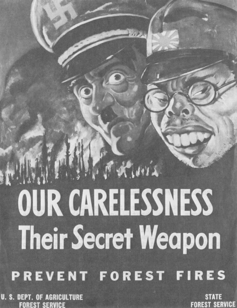
In other ways, the antiwar posters are much like their opposite numbers: they manipulate guilt enthusiastically; they zealously celebrate the laborer. Even when the antiwar posters seem to attack the flag, they appeal to the nationalism of their audience: “It is not we,” they seem to say, “who put the swastikas where the stars belong; we just showed you they were there.”
Separately, each exhibition offers itself as documentation of an art form captured by politics or, if one prefers, of a political medium inspired by artists.
Compared, the exhibitions give evidence of the poster’s dissident origins (it’s said to have been invented by Martin Luther as a way of furthering the Reformation), of changing propaganda techniques, and sharply underline the different characters of popular and official propaganda.
Some of the posters don’t “wear” well. Others are as powerful today as they were before. But these are historical exhibitions, more important for what they reveal about the societies which created them than for any artistic merits the exhibits themselves may display.
One expects to find differences in the propaganda techniques of totalitarian and democratic societies, but one is surprised to find so many similarities as there are. Both sides seize on their people’s weaknesses (e.g., guilt, chauvinism, xenophobia, racism) and manipulate them in the national cause. Similarly, one is surprised to find Nazi Germany and class-conscious Britain joining America in celebrating the simple laborer at the expense of the social elite. Indeed, examining the war posters of any country, one is led to believe that every army is a People’s Army; that all armies act only in self-defense; that there are no officers except in the enemy’s army; that the enemy’s concerns are rape, plunder, heresy and enslavement while one’s own countrymen seek only to defend the pastoral homeland.
American antiwar posters predictably attack all these notions: the American army, they say, is The Man’s Army; its function is solely to murder, destroy, and enslave for profit; it is ruled by a privileged elite of crypto-fascist officers leading working-class innocents their doom.
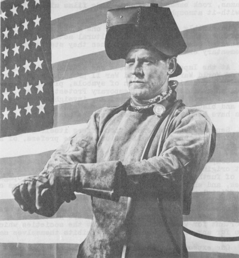
The exhibitions illustrate the techniques of persuasion. But they also bring to the viewer’s attention some peculiarities of the conflict in Vietnam. Among them: why are there no posters extolling the merits of, and appealing for aid in, that war? Why are there only posters attacking the conflict? Has America abandoned domestic propaganda in war-time, or simply changed its tactics? Could the nation which invented the laser-bomb have over-looked the tactical advantages of domestic propaganda? Is it an accident that the poster is today the exclusive province of advertisers and the Left?
Cold Blood
In a 1969 speech to a group of bankers at the University of Wisconsin, former Secretary of State Dean Rusk said, “We haven’t tried to build up a wartime psychology in this country. We’ve had no big military parades, as we did in World War II. There are just too many megatons laying about. In other words: we’ve had to do in cold blood (referring to Vietnam) what soldiers do in fever.”
Later, Rusk added, “That decision may have to be reversed.”
Implicit in the first part of his statement is an acknowledgement of a practice which the Imperial War Museum documents so well and which both liberals and conservatives tend to abhor: governments work domestically to manipulate the minds and passions of those they govern.
That should, of course, surprise no one, especially in an election year during which images are discussed as frequently as issues.
Yet more interesting is Rusk’s assertion (seemingly tinged with noblesse oblige) that America has not attempted to build up a wartime psychology over Vietnam.
The “reason” offered for the alleged demurral — “there are too many megatons lying about” — can probably be disregarded as a bit of propaganda itself. That seems to be so because the “reason” is coded on only three possible premisses (all implied):
that a nuclear freelancer (a la Dr. Strangelove) might, if fired up by public opinion, take the war into his own hands; or,
that the elected government is so susceptible to public opinion that it would risk a popular Armageddon rather than a defeat at the polls; or,
that a manufactured bellicosity within the United States would have an emotional Domino Effect internationally, plunging the world into radioactive desolation.
But these are pseudo-premisses. Mr. Rusk is unlikely to hold any of them seriously and, if he did, even more unlikely to bring them so near the public’s attention.
The government’s own experts have repeatedly assured us that the first premise is impossible given existing fail-safe precautions.
The second premise may also be dismissed since if the war in Vietnam has proved anything it is that the elected American government does not respond immediately and passionately to demonstrations of public opinion. The democratic process is too slow, and the president too isolated, for this premise to be viable. Moreover, it implies (which Mr. Rusk would never mean to do) that the mechanisms of persuasion, or “thought control”, are wielded by a group of cooler heads than those the people have elected.
The third premise is too baroque to merit consideration. Nothing suggests that history or governments work that way.
The clue to Mr. Rusk’s important, if somewhat dated, speech may lie in his assertion that “The decision (not to build up a wartime psychology in the United States) may have to be reviewed” (and, one is tempted to add, despite the fact that there are “too many megatons laying about.”)
Has the decision been reviewed? Apparently not, as witness the absence of war posters in the museums. No, if anything, the American government has, for more than 10 years, sought to de-emphasize the war in Vietnam. It has intentionally avoided the traditional domestic techniques of psy-war, preferring to mask the involvement with well-publicized troop withdrawals, “Vietnamization,” and so forth.
Why? Probably because the nature of the war in Vietnam, undeclared, limited, far off, and conducted against an enemy whose resources are far less than America’s own, makes the full, “psyched-up” involvement of the American people unnecessary and, therefore, potentially undesireable.
It may be the analysis of government planners that civilian consciousness of the war effort constitutes a variable that is superfluous to the solution of what they believe to be a purely military equation. Unable to be of meaningful help, such civilian awareness could become a source of trouble.
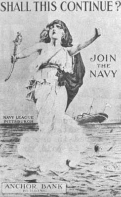
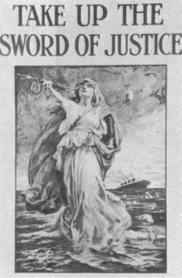
Somewhere along the historical line, of course, the quiet conflict in Vietnam exploded into a subject of vitriolic debate at home. The non-campaign of the war’s planners was defeated by the emergence of the New Left and that amorphous group’s skillful manipulation of the media.
Anti-Antiwar
It was the great success of the New Left. But, with the advent of student demonstrations, the antiwar poster, and the emergence of a (then-) vigorous underground press, came an oblique response: the anti-antiwar campaign whose slogan — “America, Love It or Leave It” — and whose standard -bearers, the “Silent Majority,” had as their focus not a defence of the war, or a call to arms in Vietnam, but a chauvinistic attack upon domestic dissidents.
There can be no doubt that the anti-antiwar campaign proceeded to some considerable extent under government direction. Speeches by Administration officials led an attack against both demonstrators and the media which provided the latter with a platform. Some political activists were sentenced to extraordinary prison terms for minor drug offences. Antiwar organizations and liberal religious groups were infiltrated and put under surveillance in an effort to counter their pacific objectives. While no big military parades were staged, wildly nationalistic processions were meticulously and expensively organized around America’s astronauts.
 Simultaneously, very large amounts of money were spent to bolster the military’s beleaguered and sagging public relations posture. Indeed, the oblique and reactive campaign against those who opposed the war even included the interference of then-President Lyndon Johnson in at least one local “peace” referendum (Johnson urged top administrators of the American Legion to lobby, in apparent violation of the group’s tax-exempt status, against the first such referendum in Madison, Wis. in 1967). More recently, President Nixon and Vice-President Agnew have urged the people to “stand up and speak about what is right with America” (presumably this precludes a discussion of the war).
There are few artifacts of the anti-antiwar campaign. What there are would make an unspectacular, almost subliminal, exhibition. A flag-pin here, a bumper-sticker there, a poster advertising John Wayne’s “The Green Berets,” and perhaps a few buttons with patriotic messages.
But such an exhibit would contain only the detritus of what has been called the anti-antiwar campaign. The essence of that campaign lies elsewhere — amid more sophisticated means of expression. Like television.
It was no accident that, in choosing to encourage enlistment while simultaneously re-ordering the Army’s image, the military recently opted for a massive television campaign.
That option was not open to governments before 1945, but it is today and seems likely to be exploited ever more fully. If so, the poster may be as obsolete at the M-1 rifle, at least in-sofar as the government(s) are concerned.
Poster vs. Tube
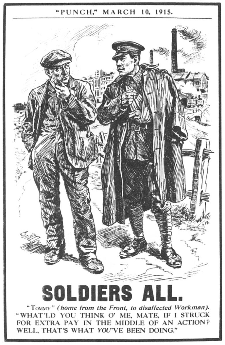
Cyril Kenneth Bird, who creates under the pseudonym “Fougasse,” was one of the most popular and, therefore, successful war-poster painters during World War II. Fougasse saw three obstacles to the success of any poster, according to a publication of the Imperial War Museum. The first obstacle was “a general aversion to reading any notice of any sort. Secondly, a general disinclination to believe that any notice, even if it was read, can possibly be addressed to oneself; thirdly, a general unwillingness, even so, to remember the message long enough to do anything about it.” Fougasse attempted to overcome those obstacles with his art: his posters were stylistically simple, and their cartoonish character and short messages invited comprehension with the lure of humor.
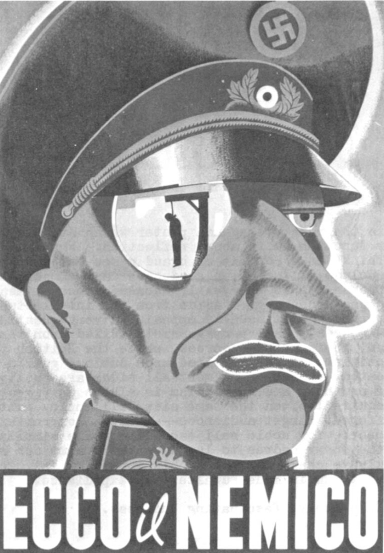
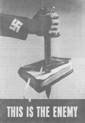
Representations of the enemy, however, are nearly always the same. He is seen as either a brutish, raging apparition (as in Norman Lindsay’s “?”); as a comic figure (Fougasse’s mocking illustrations); or as a merciless elitist (e.g., Koehler-Ancona’s “Ecco il Nemico,” “This is the Enemy”). The identical pattern exists in antiwar posters wherein American presidents are depicted in the same three ways.
Television, by its very nature, dismisses all of these obstacles.
It is watched from a seated, usually comfortable, position by people during their leisure hours. The viewer is typically imbued with an inertia that makes not paying attention a greater effort than simply staring at the “tube.”
Secondly, the disinclination to believe that the message is directed at oneself is largely overcome by the “living-room characteristics,” the intimacy of television. The message is delivered in one’s own home and, usually, it is delivered by a professional who is paid to inspire trust. It is a medium of eye-contact.
Fougasse’s third obstacle is overcome by the same “inertial characteristics” of the television medium that overcame the first: the viewer will remember the message because he will see it over and over again. Only when the message is so familiar as to be sickening will the viewer rise to flee the living-room or change the channel and, by then, he will know it by heart. Almost everyone has had a conversation like this:
“God, I hate that commercial.” “Me, too; it’s so stupid.” “So irritating.” “Should I change the channel?” “No, it’ll be over in a few seconds….”
oMoreover, poster attempts at serialism and repetition can only strive toward, but never reach, the animation of television. Nor can the poster ever communicate to an audience the size of television’s.
Which is to say that the potential of the poster as a medium of persuasion is in every way inferior to the potential of the boob-tube. Indeed, the poster’s only advantages would seem to lie in its being cheap, decorative, and amenable to popular production. It is not, however, so inexpensive as to rival the cost-effectiveness of television.
It is for these reasons — a desire to downplay the war in Vietnam and the improvement of persuasive techniques — that the poster has once again become a truly popular medium. It has been re-inherited by the (relatively small) businessman, the dissident, and the poor.
Some Problems of Review
There are very basic difficulties in “reviewing” an exhibition of political posters, aside from the fact that television has made them artifacts.
Is their value to be assessed solely in terms of their art, or according to the objective merit of their politics, or with regard to their purely persuasive characteristics? Indeed, can these be separated? Moreover, and with regard to this third question, isn’t persuasion itself to be measured in terms of the acts it does, or doesn’t, generate?
Poster art opens a Pandora’s Box for the critic. One must even ask whether it is art at all. Most posters depend for their effect upon discrete historical situations that may not remain in the memory as long as the posters remain in the museums. An example of this last failing is Fred Spear’s beautifully executed WW I poster, “Enlist.”

Looking at the figure of the drowning mother with a baby in her arms, the word Enlist leaping out from the ocean floor, the contemporary viewer is tempted to mutter, “Not on your life.” Enlistment seems equated with drowning. But the 1915 viewer had an entirely different reaction. The poster conjured up, as it was meant to, the hated sinking of the Lusitania in which 128 civilians were lost.
It is this historical fragility that makes criticizing poster art in aesthetic terms difficult or impossible. What was once lucid and powerful may become cryptic or even ludicrous shortly afterwards.
Other examples of this same flaw abound: von Hindenburg’s craggy face is no longer recognized, the mythos of the knight in shining armor (used extensively by both sides in WW I) fails to inspire as it once did, and many of the symbols so successfully exploited in earlier years (Uncle Sam, the “Squander Bug,” and so forth) seem corny today.
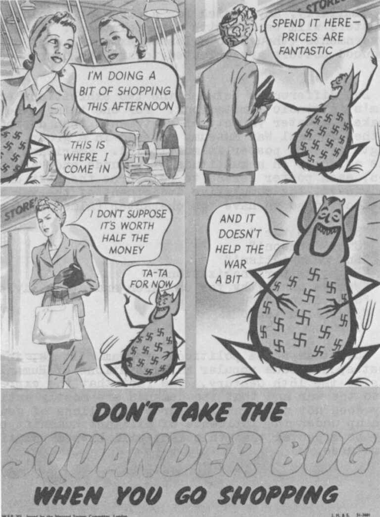
To criticize posters on their objective politics is even more hopeless because, almost without exception, they have none. The Russian posters identify a kind of muscular fraternity with the communist regime, but Nazi and British posters exploit the same image in their own behalf. In WW II America, Norman Rockwell’s very successful series of four posters illustrating “Freedom of Speech,” “Freedom of Worship.” “Freedom from Want,” and “Freedom from Fear,” collectively titled “OURS…to fight for”) come closer to a political stance than any of the others. But even Rockwell’s series partakes more of glittering generalities than it does of ideology.
To evaluate the posters in terms of their persuasive characteristics, with the implied criterion that this will be measured by their success in generating action, is almost impossible. There is little direct evidence that any purely persuasive poster ever caused anyone to do anything. It is even questionable whether that is their intention after all. It may be that the primary function of the propaganda poster is simply to influence attitudes, to manipulate morale — but most of the posters have specific messages (enlist, buy war bonds, give, waste-the-food-and-help-the-hun).
At the ICA, protest posters exhibit much of the same resistance to criticism as do the exhibits at the war museum.
After only 5 years, caricatures of Lyndon Johnson and the Great Society fail to inspire powerful emotions and posters (of which there are many) that rely on these images for their impact seem irrelevant today. Like von Hindenburg’s, Johnson’s face is robbed of its emotional content by the passing years.
Similarly, any search for a coherent ideology among the Protest Posters will be met with disappointment. Like those issued by the governments (though to a lesser extent), most of the popularly-produced posters are oriented toward the heart and not toward the head.
But differences between the two exhibitions emerge, despite the medium’s intrinsic limitations. For one thing, the Protest Posters make a greater variety of statements than do their counter-parts at the Imperial War Museum. Viewed in a group, as at the ICA, the strength of each poster is multiplied. American involvement in Vietnam is attacked on a multitude of grounds and, as one tours the exhibition, each poster serves to reinforce the next until, when all have been viewed, the cumulative indictment of the war is so broad and multi-faceted as to have the character (almost) of a political program:
“Stop the War!”
“Stop Johnson!”
“End colonialism!”
“Fight de-personalization!”
“War is unhealthy for children and other living things.”
“Stop Nixon!”
“End pollutionl”
“Think.”
But it is not a political program. It is, instead, one of the most spontaneous popular manifestations of Humanism to be found outside the 16th Century. The fact that the expression is a reaction to the war and that its demands are mostly articulated negatively does not diminish its force. Millions of young Americans have grown up under the influence of militant humanist propaganda, and it may be expected that this fact will have a political impact as youth matures.
Whether that effect will be profound or minor is difficult to say.
Evidence for both possibilities exists. Most young people who are openly opposed to the war, pollution and totalitarian regimes nevertheless pay taxes required for the war, continue to pollute the environment and, if they have the chance, vacation in Spain, Greece, or Portugal. And then again, some don’t.
There is no way to determine the depth of the impression made by counter-cultural agit-prop. Images of slaughtered children, maimed adolescents, blasted hamlets, psychedelic pigs, copulating rhinoceri, Bobby Seale, and a pregnant Girl Scout may succeed in their intentions to shock, disgust, inspire, or delight, but it is impossible to learn whether those reactions make a permanent impression, or whether they are stillborn.
Protest and Commodity
The ICA exhibition of Protest Posters is a limited one. It is composed of posters that are now, or once were, commercially available.
That limitation is a practical one designed, in part, to make the exhibition manageable. In university campuses, ethnic ghettos, the high schools, and in youth communities, dozens of protest posters are turned out each day across the United States. There can never be a comprehensive showing of these and, indeed, most of such posters are forgotten after the last one has been torn down or blown away.
By choosing to exhibit only those examples of the medium which have been commercially exploited, the exhibition necessarily excludes almost all the action-posters that have been produced, while at the same time guaranteeing a relative uniformity of technical excellence in the exhibition.
Collector Kunzle is among the first to admit the debility that results from the action-posters’ absence. Such posters, often hastily produced by amateurs to publicize a specific demo, meeting, or trial include some of the most vital examples of protest art created in the past decade. As a group they have a documentary flavor, a grass-roots brutality of style that the commercial posters avoid (with a few notable exceptions such as the Museum of Modern Arts’ “Q. And Babies? A. And Babies.”).
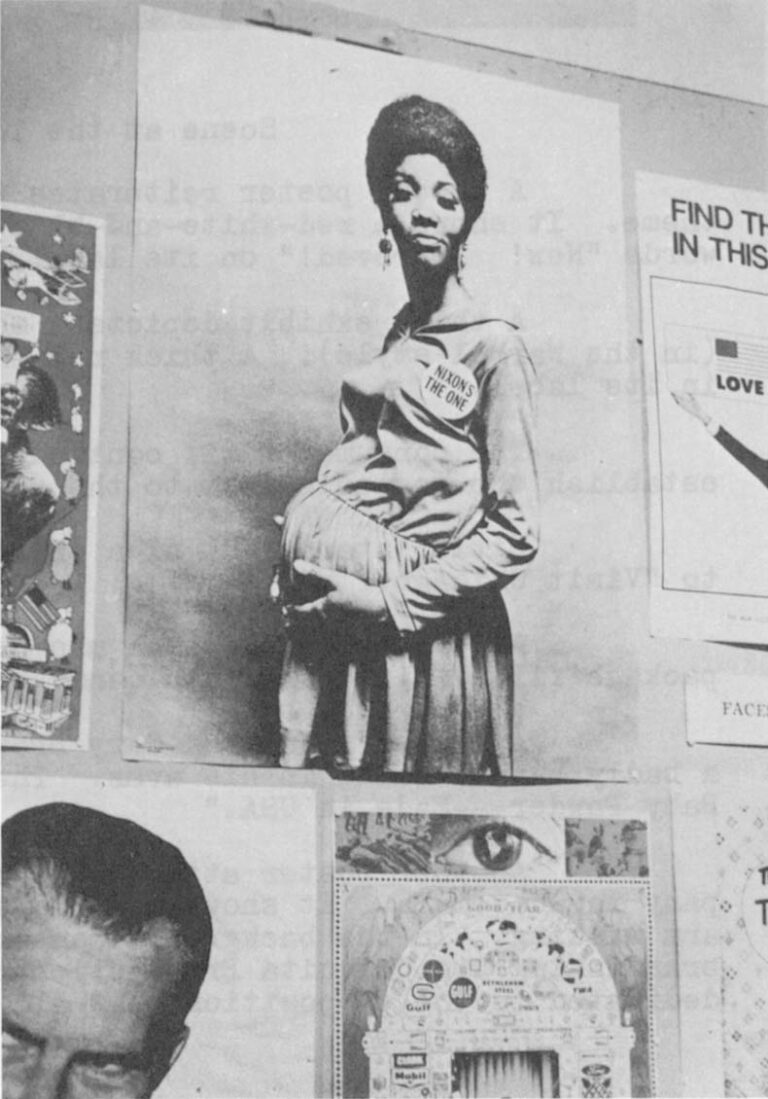
From Kunzle’s Exhibition
Button Reads:
“NIXON’S THE ONE”
It’s in an uncommercial atmosphere that the righteous anger of the antiwar movement is best able to breathe. Clumsy and uncompromising, with a penchant for turgid rhetoric, and a reliance on stolen paper and taboo words, the action-posters communicate with blunt precision.
So Kunzle’s ICA exhibition is somewhat distorted. Its exhibits are blatantly professional, and the incidence of satirical wit among them is greater than is to be found on the streets (where an angrier tone prevails). In the same way, the Kunzle collection is more positive in outlook than a random sample of protest posters would be.
Reasons for the distortion aren’t hard to find. Because the posters are commercially conceived, their decorative function often takes precedence over their political utility. Since these are works of art designed to be placed in private homes or apartments, their primary function is of an aesthetic or entertaining kind. It is the rare individual who will decorate his apartment with, for instance, a series of framed atrocities, or quotations from Mao. Love, peace, beauty, and humor are simply more saleable than hate, war, horror, and ideology. As a result, the former have a greater representation in the ICA exhibition than do the latter.
As Kunzle says, “Peace and Love-Your-Neighbor posters exist literally in thousands, and outnumber Hate-the-Enemy posters more than ten to one (a statistic which may be of some comfort to the nervous liberal). Simple affirmations of the desire to live in love and peace may have been political in the heyday of the love-in (1966-7); they can no longer be considered so in the stricter sense, and posters of this kind are included in the exhibition as a complement to the anti-war poster; like the latter, the love poster is wholly a product of an anti-war sentiment.”
Kunzle makes a noble, and highly intelligent, effort to put the protest posters in harmony with the social protest that inspired them, but their commodity status makes his job harder.
As a result, humor (of various shades, but mostly black) rides herd over the ICA exhibition, and sets the tone of most of the posters.
At the ICA
A poster signed “Nordahl (copyright Gross National Product)” sees the war as an epic motion picture. Heavy block letters, blood red, spell out “Vietnam” over a photo-montage of Lyndon Johnson in a lawn chair, soldiers, crosses, children, bodies, and jungle.
“An Eastern Theater Production,” says the advertisement, and continues: “See — a cast of thousands!
“See — modern atrocities in full color!
“See — the accounts of a nation destined to save the world in spite of itself.
“Gripping…moving…a film the whole family is sure to enjoy.
“Price of admission: your son plus taxes.
“Filmed in real Blood ‘N Guts color.”
A second poster reiterates the consumer motif of the film theme. It shows a red-white-and-blue aerosol can of Mace with the words “New! Improved!” on its label.
A third exhibit depicts a monumental Campbell’s Soup can (in the Warhol style). A thick red paste leaks from a bullet-hole in its label.
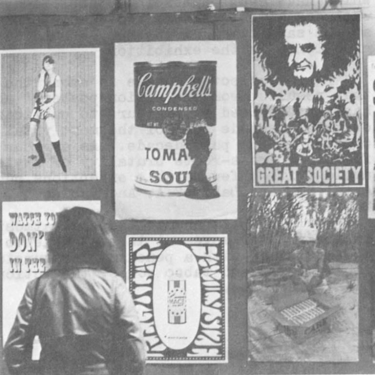
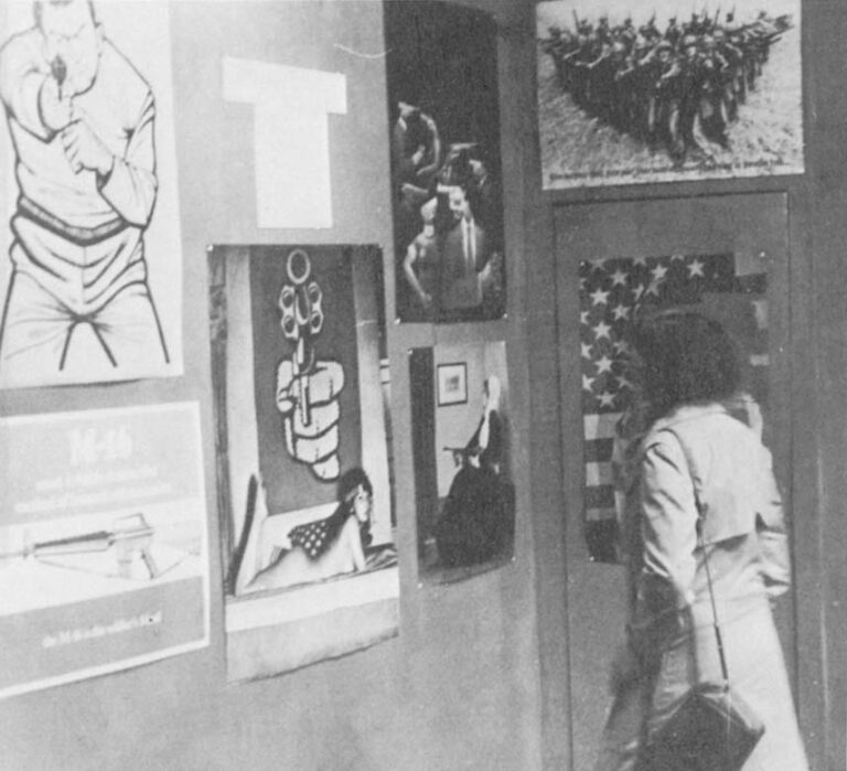
The consumer motif continues throughout the exhibition to establish the poster’s debt to the advertisement.
Hitler stares out of a travel poster, urging the viewer to “Visit Chicago.”
An emaciated oriental man hunches glumly over a C.A.R.E. package filled with Baby Ruth candy bars.
A poster signed by Gary Brown shows an oriental holding a badly burned child in his arms. The caption reads “Johnson’s Baby Powder — Made in USA.”
Another poster attacks the role of the United Fruit Company in Guatemala. It shows a Third World child with half his right arm missing. In the background, an immense banana rears half-peeled, brandishing its Chiquita Brand sticker. The words say “This page is dedicated to the proposition that all bananas are not created equal.”
Others show a smiling Nixon and ask “Would You Buy a Used Car From This Man?”; Johnson standing within a Roman arch composed of brand names and corporation trademarks, photos of Vietnam in the background: “Think” is the eloquent message. Elsewhere Johnson is seen as a raging King Kong, smashing American symbols, crushing representations of “Civil Rights” and “Peace and Freedom” while sheep file dutifully into a building labelled “Draft Board.”
The metamorphosis of a poster.
The original magazine cover was created by Alfred Leete and depicts Britain’s Lord Kitchener.
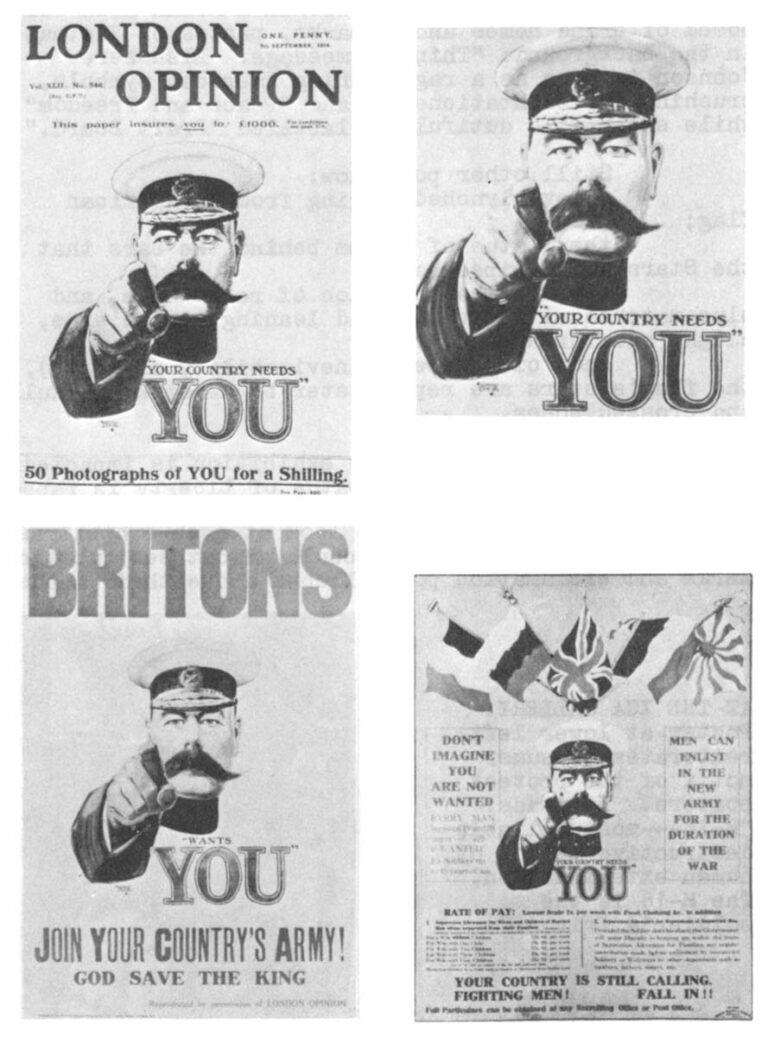
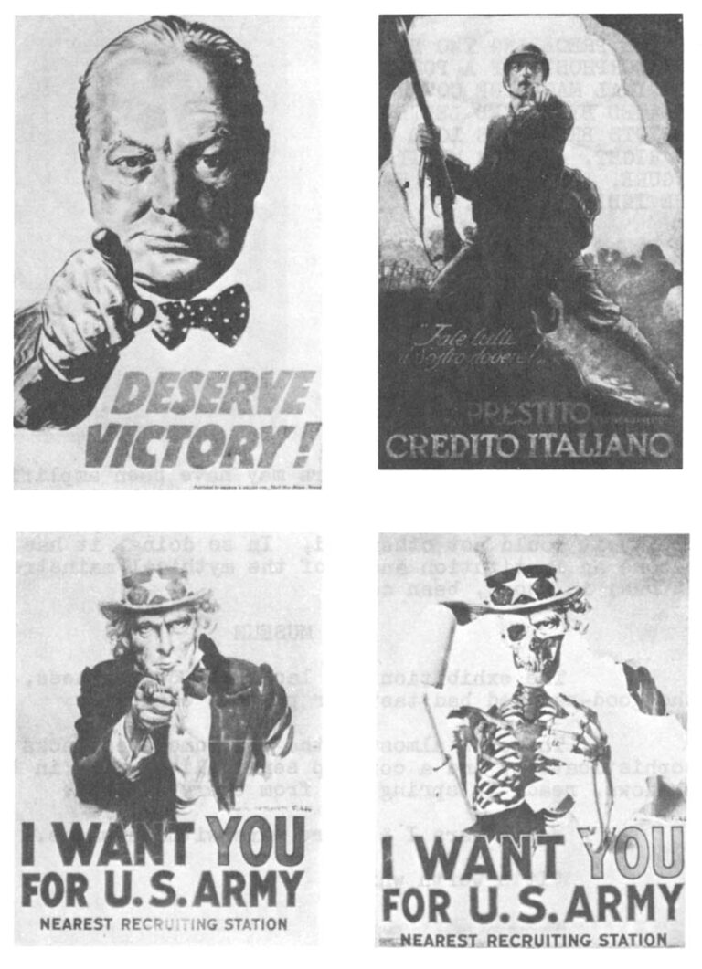
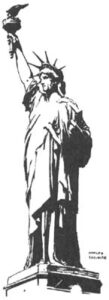
Still other posters at the ICA show: a dove lynched by the tassel hanging from an American flag; the Statue of Liberty peeping from behind the bars that the Stars and Stripes have become; the American flag as a construction of red, white, and blue matches with one match, burnt black and leaning to the side, alight and threatening to ignite the whole; and, of course (it takes on the inevitability of logic), the flag’s stars are replaced in another poster by swastikas, skulls, and crossed bones.
Further down the ICA gallery (the exhibition is impacted along two walls about 60 feet long), the Statue of Liberty is raped, Santa Claus becomes a pall bearer, the Moon polluted, police transformed into pigs, and Uncle Sam is revealed as a beckoning cadaver.
It is, despite its relative commerciality, a heady exhibition.
The images are often potent enough not to be digested in a glance. At the ICA, the gallery-goers wandered down the aisles slowly, studying each poster. When they came to the gallery’s end, they returned the way they came, pausing to look at each exhibit as carefully as they’did the first time. One could almost see question marks and exclamation points mingling in balloons above their heads.
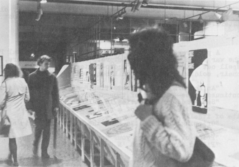
Scene at the ICA
ndeed, the potency of the posters may have been amplified, not only by their presence in concentrated numbers, but by the national characteristics of the British observors. That is, British viewers (who had not seen most of the posters before) took obvious delight in their unfamiliarity, in the unabashed savagery of the presidential caricatures, and in the qualities of brashness and over-statement which marked the exhibition. While both qualities are considered alien to the supposedly traditional British “reserve,” they seemed to delight rather than to offend.
Moreover, the simple fact that these posters are commercial, that they sell, is in itself an index to the nature and depth of anti-establishment feeling in the United States. By reaching the status of a marketable commodity, dissent has assumed a respectability it could not otherwise have achieved. In so doing, it has become an institution and a style, a part of the mythical mainstream. It has, in short, been co-opted.
The Imperial War Museum
The exhibition at the war museum lacks the compactness, and the good-natured bad taste that the antiwar posters exhibit.
There is almost no photography, the wit sometimes lacks sophistication, and a corny, seemingly camp sensibility waits in the shadows, ready to spring. Nostalgia drips from every exhibit.
World Wars I & II. Now those were wars with messages.
“It’s worth while. That’s why!”
“Holding the line!”
“Go by Shank’s pony!”
“My girl’s a WOW!”
“The ‘easy’ girl-friend spreads Syphilis and Gonorrhea, which unless properly treated may result in blindness, insanity, paralysis, premature death.”
“Perhaps this’ll teach you to stay at ‘ome next ‘oliday.”
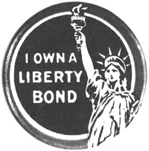
“Lend to Defend His Right to Be Free: Buy Defense Bonds.”
“Give or we Perish.”
“Put strength in the final blow. Buy War Bonds!”
“Help the horse to Save the Soldier.”
“Careless Talk Costs Lives.”
“Give ‘Em Both Barrels! “
“Serve in the WAAF with the Men Who Fly.”
“And still the Railways carry on!”
“S’long Dad! We’re shiftin’ to…. Blimey, I nearly said it!”
“Coughs and sneezes spread diseases.”
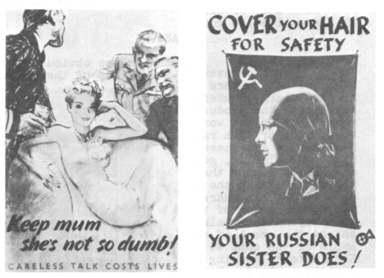
Indeed, only in militant women’s liberationist publications of the 1970’s is one likely to encounter the same unglamorized, industrially-productive, and dogmatically idealized female figures that one finds in the war posters. (Glamor was considered counter-productive and frivolous during the war; so much so that British women were urged to emulate their drabber Russian sisters. Similarly, beauty eventually became identified with the seductive spy and the syphilitic slut.
Few of these posters could survive peace. Their vulnerability to sarcasm and lampoon is manifest, especially in an era sated with the rueful cynicism Vietnam inspires.
And yet there is actually very little that is camp here. Almost none of the posters collapse of their own weight, fail by trying too hard. An aura of credibility surrounds the exhibit, advertising the good will with which the posters were received by most of the peoples at whom they were directed.
Artistically, the exhibition at the Imperial War Museum is probably more successful than the one at the ICA. There is a greater variety of style, more frequent recourse to experimentation and the creation of new symbolism, and the level of technical excellence is also superior.
More interesting than the purely artistic merits of the war museum exhibition are the comparative ways in which the societies at war viewed themselves and their enemies.
German Posters
With abstraction and experimental art banned or discouraged in both Nazi Germany and Soviet Russia, one finds in the WW II posters of these countries a banality so pure as to be transcendental.
Biceps popping and aglow with robust determination, an idealized farmer casts caricatured Jews, Bolsheviks, journalists, and American financiers out of Germany. The caption reads: “We farmers are mucking out. We vote List 2 National Socialist.”
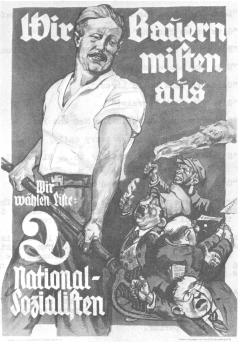
Poster by Felix Albrecht for 1932 election
A second poster urges contributions for the construction of youth hostels and homes. Making the appeal is a Nazi version of the girl-next-door, a teen-aged Doris Day figure who flaunts her good health like a medal for bravery. She holds out a flower-bedecked collection-can emblazoned with a swastika.
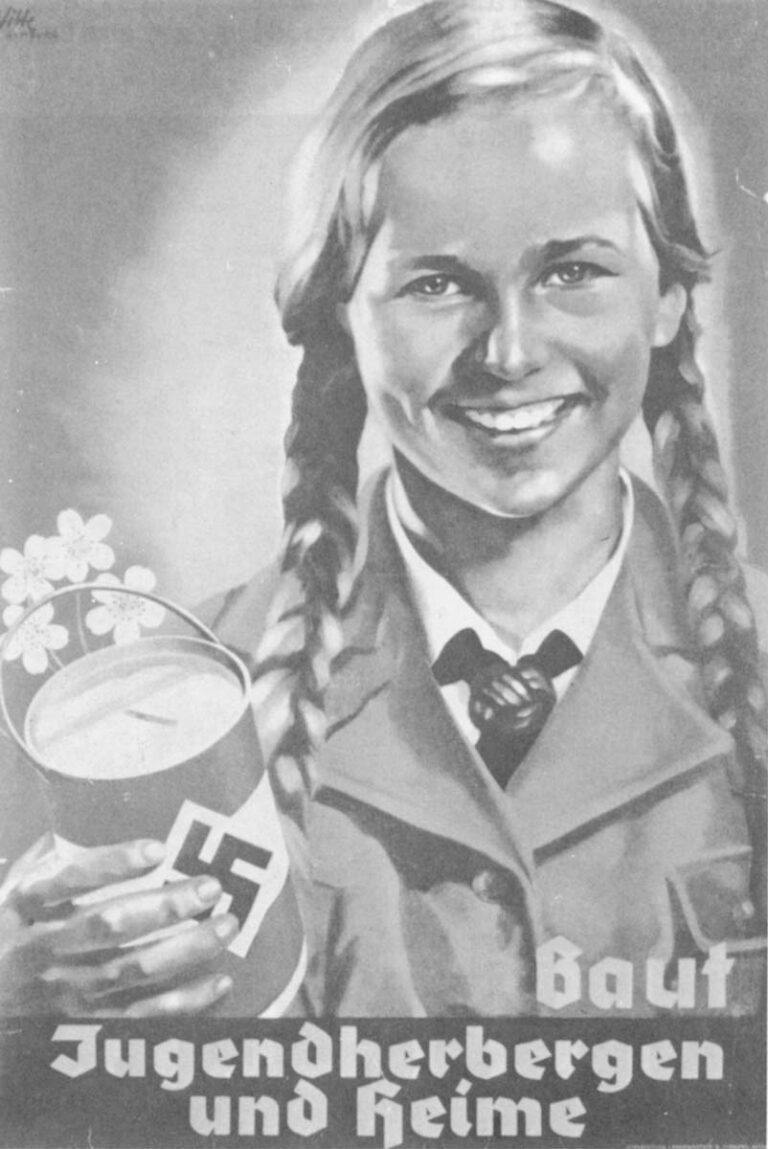
“Build Youth Hostels and Homes.”
Poster by Hermann Witte (1938).
A third poster shows the face of Adolph Hitler looming out of a black background. According to the Nazi party, which published the poster in 1938, “Peace, strength and goodness radiate from Hitler’s face. The effect on men with uncorrupted souls must be good.” The poster is so simple, however, as to be ambiguous. Where the Nazis found the above-mentioned qualities, another person may see only a vacous stolidity or brooding malevolence whatever the state of his soul may be.
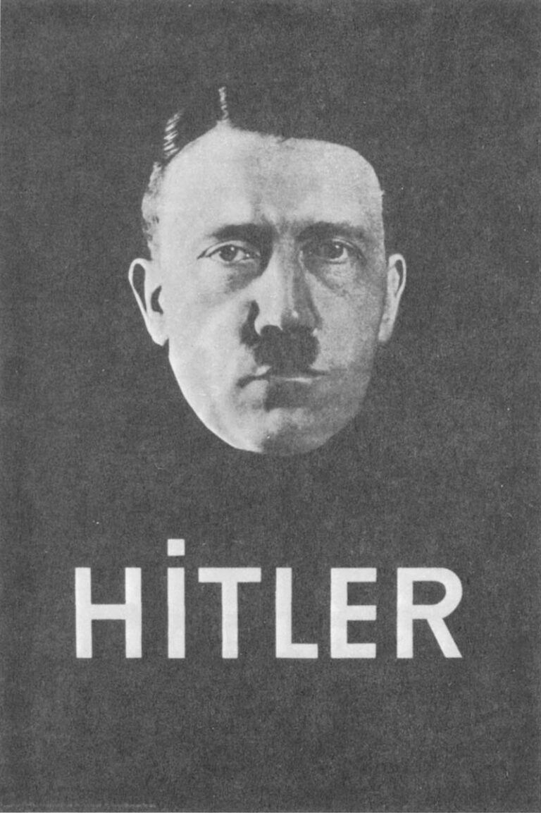
Anonymous
The Nazi’s stylistic simplicity and over-weaning emphasis on cleanliness and good health is in sharp contrast to Germany’s WW I posters. In the latter one discovers a more complex, myth-oriented imagination at work.
Knights in shining armour abound, dragons rage, gauntlets smash down, and doves flutter above plumed helmets. An heroic-looking prisoner of war stares grittily from behind prison bars, while yet another poster evokes a ghostly young madonna in an appeal for the collection of women’s hair (needed by industry).
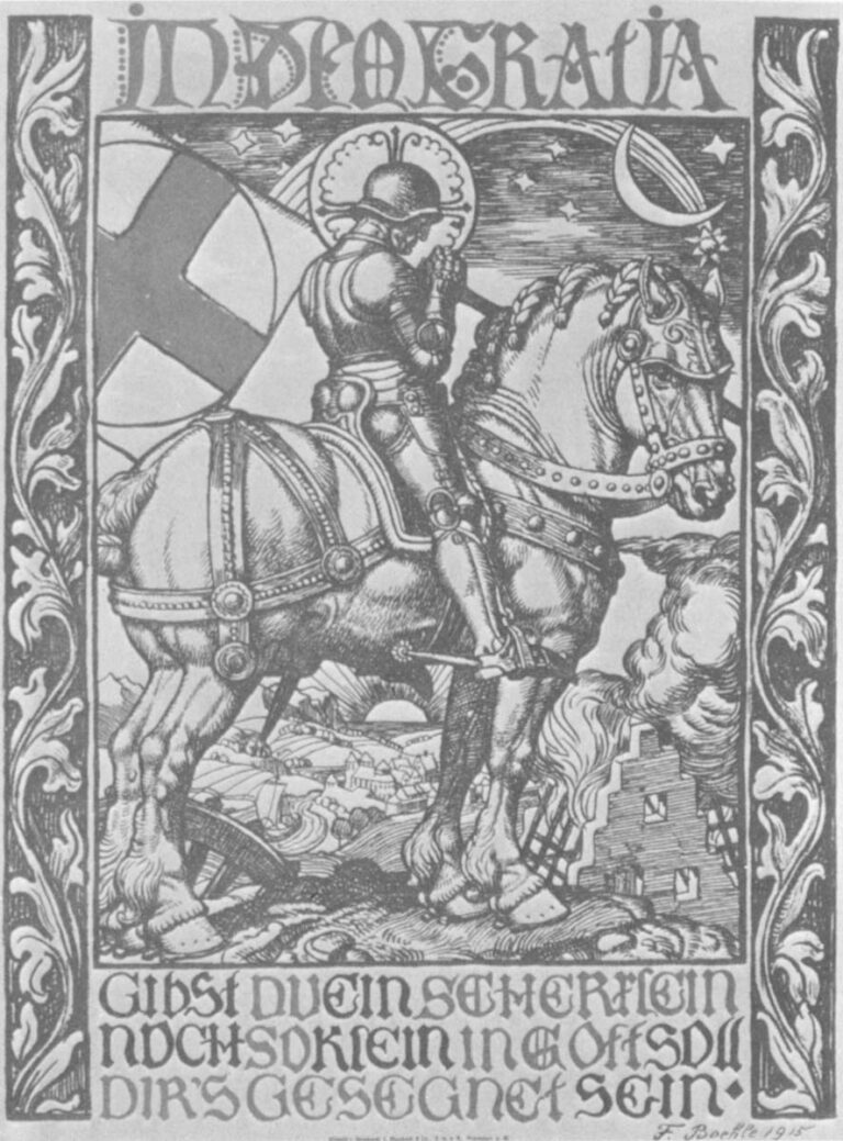
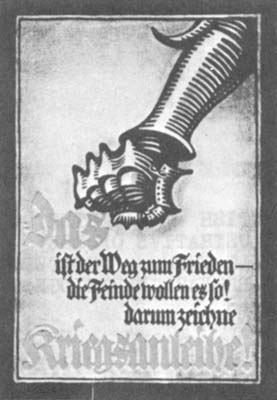
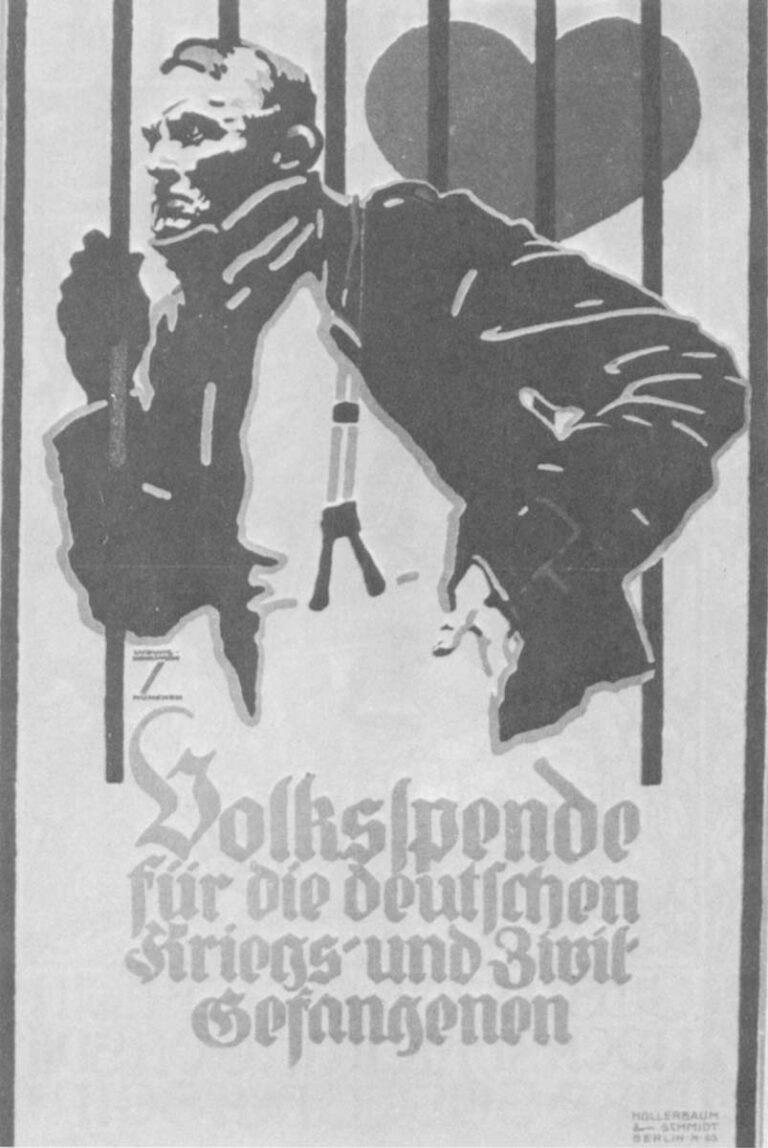
Moreover, the German WW I posters evidence a respect for artistry, a flair for layout and the sophisticated use of color, that is nowhere to be found in their WW II successors.
Perhaps the explanation for the banality of Nazi propaganda (and contemporary American television) is in Mein Kampf:
“All propaganda,” Hitler wrote, “must be presented in a popular form and must fix its intellectual level so as not to be above the heads of the least intellectual (person). This…level will have to be that of the lowest mental common denominator among the public….”
In accord with this precept, one finds Hitler’s propagandists burying all wit and subtlety, relying wholly upon bland assertions. In order to gain support the propagandists simply announced that support’s existence: “The entire people says yes!”
“We vote List 2 National Socialist.”
In a similar way, Nazi propagandists shrewdly linked Hitler with victory by distributing a poster that read: “Adolph Hitler is Victory.”
The theory behind this approach is an odd one. By choosing the “lowest common mental denominator” as the target audience of his propaganda, Hitler seemed to be assuming one of three things:
If the stupidest person can be convinced, the smarter ones will follow his leadership;
It is the dumbest who have the most political clout;
Only an idiot would oppose us.
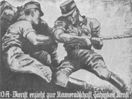
Guilt Motif
Guilt is one of the favorite emotions of propagandists because it is so easily manipulated. Certainly the greatest manipulators of guilt in the poster universe are the antiwar activists. But the British must rank a close second.
“Daddy, what did you do in the Great War,” a little girl asks her father. Obviously, from the father’s puzzled expression, he did nothing in the Great War and this is a cross the whole family’s going to have to bear for decades.
Another WW I British poster has Admiral Nelson asking, “Are YOU doing YOUR duty today?”
In a poster created by Lord Baden-Powell (founder of the Boy Scouts), six figures perform their productive war-time duties. At the side of the poster, cigarette in his mouth, is a dandified idler. The caption asks, “Are YOU in this?”
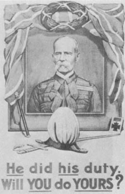
The guilt theme is re-worked by the British in WW II.
“Waste the food and help the Hun.”
“Perhaps this’ll teach you to stay at ‘ome next ‘oliday.”
“Is your journey really necessary?”
And, of course, the whole “Squander Bug” theme is directed at the collective guilt of the populace.
Up The Workingclass
But an even more curious phenomenon becomes obvious from a study of the posters from almost any war. Regardless of the country studied, large numbers of posters exist idealizing the productive roles of ordinary laborers and women. The “back-room boys,” the British railway men, and the Nazi people all share the same forthright muscularity, good humor, health, and dedication to the cause. Similarly, all sides attack the idler, the one who doesn’t do “his share.” Occasionally the idealization of the ordinary worker goes beyond the realm of reason and enters the arena of camp. A fine example of the camp WW II poster is Eric Kennington’s “Seeing It Through” which depicts a blonde, Russianized female bus conductor. A poem illustrating the image makes the artist’s dull point. A.P. Herbert is responsible for the poem, quoted below:
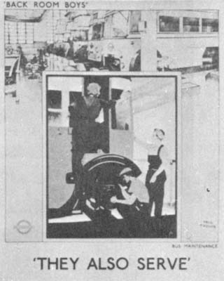
“How proud upon your quarterdeck you stand, Conductor — Captain — of the mighty bus! Like some Columbus you survey the Strand, A calm newcomer in a sea of fuss.
You may be tired, how cheerfully you clip, Clip in the dark, with one eye on the street. Two decks, one pair of legs — a rolling ship — Much on your mind — and fatmen on your feet!
The sirens blow, and death is in the air: Still at her post the trusty Captain stands, And counts her change, and scampers up the stair, As brave a sailor as the King commands.”
Some Conclusions
Generally speaking, posters are advertisements for ideas, and war posters are ads for war (“Because it’s worthwhile, that’s why!”). The conflict is often treated as a commodity in which the citizen is asked to invest his money, energy, or life. Similarly, the antiwar campaign is, in many ways, reminiscent of a consumer crusade that seeks to inform the public of a product’s deficiencies. “This war,” they advertise,”is being falsely represented; it is too costly; and may be dangerous to your health.” Where warlike governments extol folks as heroes, antiwar elements see folks as victims.
One may guess at the secret fears of the propagandists by studying the posters they produce. Often the posters identify the wartime society’s deepest ills and try to advertise them away. In this regard one notices the Nazis’ obsessive reliance on images of physical and mental well-being. In England, where class differences were (and are) pronounced and divisive, one finds an emphasis on the common cause whose burdens must be equally shared. Groups who have never been particularly celebrated come in for sudden esteem. The Cockney dialect, derided by the upperclasses in peace-time, is emulated in official government propaganda during war.
In the same way, one notices the almost complete absence of military officers in British (and German and American and French) war posters. Everyone, it seems, is a private in the People’s Army.
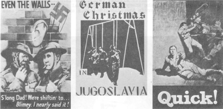
Even symbols are used in similar ways by wartime governments and antiwar artists. When the latter show the American flag as an accumulation of prison bars and swastikas, they are manipulating the same emotions which the chauvinists exploit.
Nor are there many important differences to be found among the visual tactics of Nazis, communists, or capitalists. They even share the same symboIs (the eagle, for example) and plagiarize each other’s more effective posters.
It is a phony, fascinating business.
(Special thanks to Mr. Joseph Darracott, Keeper of the Art Department of the Imperial War Museum, for his kind permission to reproduce the posters illustrating this review.)
Received in New York on August 21, 1972
©1972 Jim Hougan
Jim Hougan is an Alicia Patterson Foundation award winner on leave from The Capital Times (Madison, Wis.). This article may be published with credit to Mr.Hougan, The Capital Times, and the Alicia Patterson Foundation.


